

Instagram Ad Dimensions: 2026 Ultimate Guide
Get the latest Instagram ad dimensions for 2026. This guide covers Feed, Stories, Reels, specs, safe zones & workflow tips.
Get the latest Instagram ad dimensions for 2026. This guide covers Feed, Stories, Reels, specs, safe zones & workflow tips.
Launch day problems with Instagram ads usually don't start in Ads Manager. They start upstream, when a designer exports the wrong ratio, a media buyer duplicates an old asset, and nobody catches the crop until Meta rejects the ad or the CTA covers the headline.
That gets expensive fast for enterprise growth teams. Not because resizing a file is hard, but because unclear standards create approval loops, duplicate work, and bad handoffs between creative, paid social, brand, and operations. One wrong export can stall a campaign across multiple markets or ad accounts.
Instagram ad dimensions aren't just a design detail. They're an operating system decision. If your team standardizes the right formats, names files consistently, and builds templates around placement behavior instead of generic canvas sizes, launches get cleaner and testing gets faster.
The failure usually shows up in the last hour before launch. A designer exports a feed asset that passed review in Figma, the buyer loads it into Ads Manager, and the mobile preview cuts the offer line or pushes the CTA into a crowded part of the frame. The file meets platform specs. It still is not usable.
That gap matters more on large teams because every mismatch creates extra work across creative, media, localization, and QA. Specs are only the starting point. The critical decision is which dimensions your team will standardize for each placement, how those files will be labeled, and what happens when someone uploads the wrong ratio anyway.
For cross-platform planning, keep one shared reference for Meta ad sizes across placements. Then narrow that into an Instagram-specific production standard your teams follow.
If you need one practical companion resource on the safe-zone issue, Proven SaaS has a useful breakdown of Instagram ads size, especially for teams trying to stop text from slipping under interface elements.
Practical rule: If your team is still debating dimensions during trafficking, the workflow broke earlier in the process.
The fix is operational. Put approved aspect ratios directly in the brief. Build templates around those ratios instead of asking designers to resize from scratch. Store master assets and placement variants in one asset library, with filenames that carry ratio, market, language, and version. A file named Q3_Product_DPA_US_EN_4x5_v03 creates far less confusion than final_final_new.
The goal is not only approval. The goal is first-pass approval, predictable previews, and fewer manual checks between handoffs. Teams that get this right spend less time chasing exports in Slack and more time testing offers, hooks, and creative concepts that change performance.
When a buyer needs the answer quickly, this is the cheat sheet that should sit inside your brief, your design system, and your internal wiki. Keep one version. Share the same version across paid social, creative, and localization teams.
For broader cross-platform planning, it's also useful to compare these standards against Meta ad sizes guidance, especially when enterprise teams are aligning the same campaign across multiple placements.
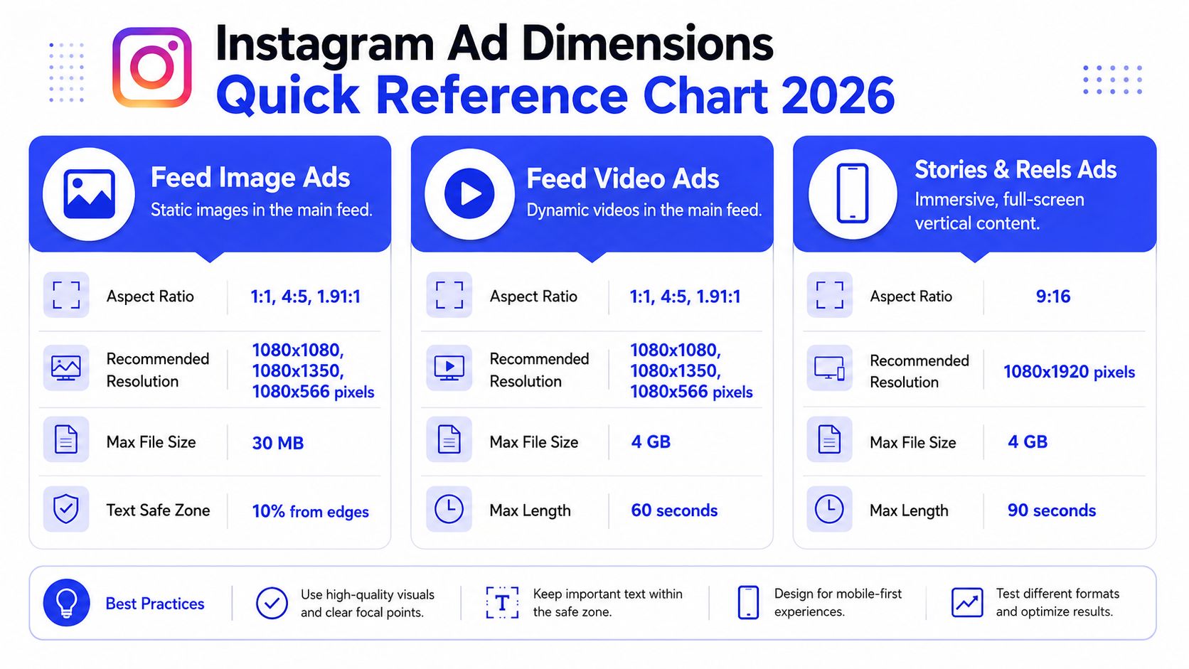
| Placement | Aspect Ratio | Recommended Resolution (px) | Supported Formats |
|---|---|---|---|
| Feed Image Ads | 1:1, 4:5, 1.91:1 | 1080×1080, 1080×1350, 1080×566 | JPG, PNG |
| Feed Video Ads | 1:1, 4:5, 1.91:1 | 1080×1080, 1080×1350, 1080×566 | MP4 |
| Stories Ads | 9:16 | 1080×1920 | JPG, PNG, MP4 |
| Reels Ads | 9:16 | 1080×1920 | MP4 |
| Carousel Feed Ads | 1:1 or 4:5 | Match all cards to one ratio | JPG, PNG, MP4 |
| Collection Hero Creative | Usually Feed-aligned formats | Use feed-safe source creative | JPG, PNG, MP4 |
| Explore Ads | Feed-aligned formats | Use feed-ready creative | JPG, PNG, MP4 |
Most spec sheets stop here. That's enough to export a file, but not enough to keep a large team consistent. The rest of the work is deciding which of these options become defaults, which become exceptions, and who owns QA when variants move between markets or business units.
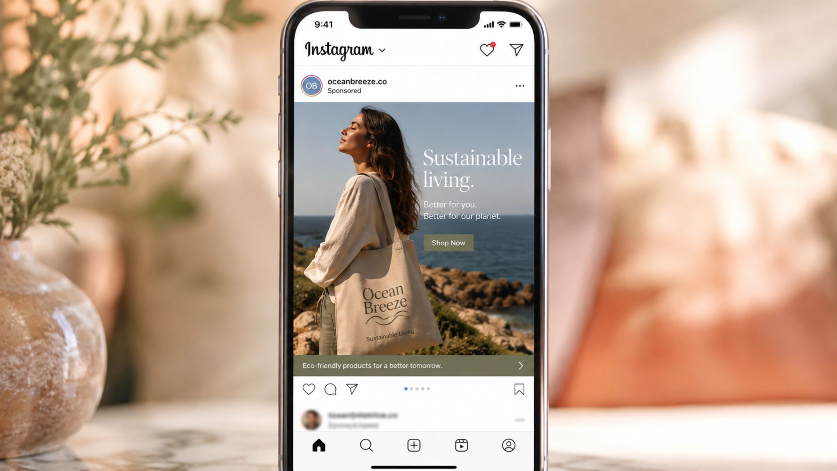
A creative director approves the final export. Paid social launches it. Two days later, the team realizes the price callout and half the offer sit under Instagram's interface on live placements. The file met spec. The ad still failed QA in the only environment that matters.

Safe zones solve that problem. Canvas size answers whether the file can run. Composition answers whether people can read it, understand it, and click before the interface covers the wrong element.
As noted earlier, 4:5 gives feed ads more vertical presence than square. The trade-off is the lower UI area. In direct-response testing cited by Proven SaaS, text placed in the bottom 340px of a 4:5 ad saw 18% lower CTR according to their Instagram ad safe zone analysis.
For enterprise teams, that is not just a design issue. It is a workflow issue. If brand, performance, localization, and production all work from different templates, the same mistake gets reproduced across dozens of variants.
Teams that run high volume creative do not rely on a designer remembering where Instagram overlays appear. They build the rule into the system.
Use a master template with a locked lower exclusion zone. Keep the main headline, product claim, and offer language in the upper and middle bands. Review against an in-platform mockup before approval. If the campaign will also run beyond Instagram, align those rules with your broader Facebook ad picture size requirements so one source file does not create different crop problems across Meta placements.
That process saves time later. It cuts revision rounds, reduces market-by-market interpretation, and keeps asset handoff cleaner between creative ops and media teams.
A safe-zone policy works best when it is documented the same way as file specs and naming rules.
| Creative element | Better placement choice | Why it works |
|---|---|---|
| Logo | Upper area, away from edges | Reduces collisions with profile, sponsorship labels, and UI chrome |
| Main headline | Upper-middle zone | Keeps the hook visible during scroll and preview states |
| Product shot | Center-weighted composition | Protects the focal point if lower UI overlaps secondary content |
| Offer copy | Mid-frame, not bottom-loaded | Prevents CTA and interface overlap from obscuring the message |
| Legal or supporting copy | Minimal, with generous edge padding | Small text loses readability first in cluttered placements |
Template governance matters here. Use separate masters for direct response, brand, and product education because each carries different text density. Name them accordingly, such as IG_FEED_4x5_DR_v03, IG_FEED_4x5_BRAND_v02, and IG_FEED_4x5_LOCALIZE_READY. When a market team pulls from the asset library, they should inherit the safe zone by default instead of rebuilding it from scratch.
The fallback rule is simple. If a team cannot confirm how an element renders in placement preview, move it up or remove it.
Treat Instagram's interface as part of the ad canvas. A file is not production-ready until the layout has been checked against the live placement frame.
Approval flow should reflect that reality. Brand approves the visual system. Paid social approves placement readability. Operations approves filename, version, and asset destination. That sequence keeps beautiful but unusable creative from entering the library, where one bad master can spread across campaigns, regions, and languages fast.
For feed campaigns, one format has earned default status. 1080×1350 pixels in a 4:5 aspect ratio.
According to AdManage's Instagram ad dimensions guide, Meta explicitly recommends 1080×1350 with a 4:5 ratio for feed videos and images. Feed placements support a range from 1.91:1 to 4:5, with 1080px minimum width to prevent blurriness. The same source notes that Instagram doesn't display widths higher than 1080px, though uploading up to 1440px can improve clarity on high-resolution screens.
In practice, the decision isn't complicated for performance teams. Use 4:5 as the standard feed master unless a creative concept depends on a wider crop.
Square still works. Wider images are still supported. Neither should be your default if the campaign depends on grabbing attention mid-scroll. The 4:5 format gives designers more vertical space to stage the product, anchor the headline, and create a stronger first impression inside the feed.
For enterprise teams, standardization matters as much as placement fit. If every market or brand pod chooses its own feed ratio, your asset library gets messy fast. Reviewers compare apples to oranges, local teams request unnecessary redesigns, and trafficking errors increase.
Use these practical rules for feed production:
Teams handling both Instagram and Facebook often benefit from a shared source file strategy. This companion reference on Facebook ad picture size helps creative ops teams align overlapping feed workflows without rebuilding the same assets twice.
Feed ad QA should be boring. That's a good thing.
Later in the review cycle, this kind of visual reminder helps align non-design stakeholders on what a feed placement demands.
When teams get feed standards right, they don't just improve appearance. They reduce rework. That's the hidden advantage of strong Instagram ad dimensions discipline inside enterprise media operations.
Stories and Reels ask for a different mindset. Teams that treat them like stretched feed ads usually end up with dead space, awkward pacing, and creative that looks imported from somewhere else.

The working standard for both placements is 9:16 at 1080×1920 pixels. That's the full-screen vertical frame your creative team should design around when they want immersive placement coverage.
A proper Stories or Reels ad doesn't just fit vertically. It behaves like vertical content. The opening frames need to communicate quickly. On-screen text needs to be readable without waiting. Product framing should assume a user is holding a phone, not watching from a distance.
That changes how teams brief the work:
For teams producing vertical video often, ClipCreator.ai's Reels dimensions overview is a helpful operational reference when briefing creators and editors on full-screen requirements.
A good Reels ad doesn't feel reformatted. It feels like it belongs in the feed around it.
Enterprise teams usually struggle here for one reason. Vertical creative gets produced by too many people with different assumptions. Social editors think in engagement. Brand teams think in polish. Paid teams think in outcomes. None of that works unless the file system and brief structure force consistency.
A practical operating model looks like this:
| Team function | What they should own |
|---|---|
| Brand or creative direction | Template rules, typography, motion style, logo treatment |
| Social creative team | Native vertical storytelling, edit pace, visual hooks |
| Media buying team | Placement selection, preview validation, variant usage |
| Marketing operations | Asset library hygiene, naming, approvals, localization routing |
For collaborative ad management, vertical production works best when teams maintain approved template families inside a shared library. One for talking-head UGC. One for product demo. One for offer-led motion graphics. That makes approvals faster and keeps the paid team from rebuilding the same ad logic every launch cycle.
Single-asset ads can't do every job. If you're showing a product range, sequencing a before-and-after story, or presenting multiple use cases, carousel and collection formats give you more room to work. They also create more ways for teams to make avoidable mistakes.
The key rule for carousel creative is simple. Every card should feel like part of the same system.
In feed placements, carousel cards are commonly built in 1:1 or 4:5 formats. The operational mistake is mixing visual logic between cards. One card uses heavy text. The next is image-only. The third shifts framing. The fourth changes background color and type scale. Technically valid, strategically messy.
Enterprise teams should treat carousel production as sequence design, not asset bundling.
A stronger internal review standard looks like this:
The best carousel ads read like a storyboard, not a folder dump.
A short internal checklist helps before upload:
| Carousel review item | What to confirm |
|---|---|
| Ratio consistency | Every card follows the same selected format |
| Visual hierarchy | The first card is stronger than the rest, not merely first in order |
| Copy pacing | Text gets shorter and clearer as the sequence moves forward |
| Product continuity | Lighting, crop logic, and branding remain aligned |
Collection ads are less about one perfect creative and more about how the hero asset works with the product set behind it. The hero should match feed-safe logic because it introduces the shopping experience. If the top asset feels off-brand, cluttered, or weakly framed, the rest of the collection won't save it.
Explore is similar in a different way. Teams often think of it as a separate design challenge, but operationally it usually rewards the same discipline that makes feed creative strong. If your feed asset library is clean, placement-safe, and well tagged, your Explore readiness improves automatically.
Here, enterprise workflow matters more than raw design talent:
Collection and Explore formats reward teams that organize assets as systems. That's why collaborative ad management isn't just a process preference. It's what keeps complex ad types from turning into scattered one-off builds.
Specs only matter if your team can operationalize them repeatedly. That's where most organizations struggle. Not with knowing the right Instagram ad dimensions, but with making sure every designer, buyer, approver, and local market lead uses the same rules.
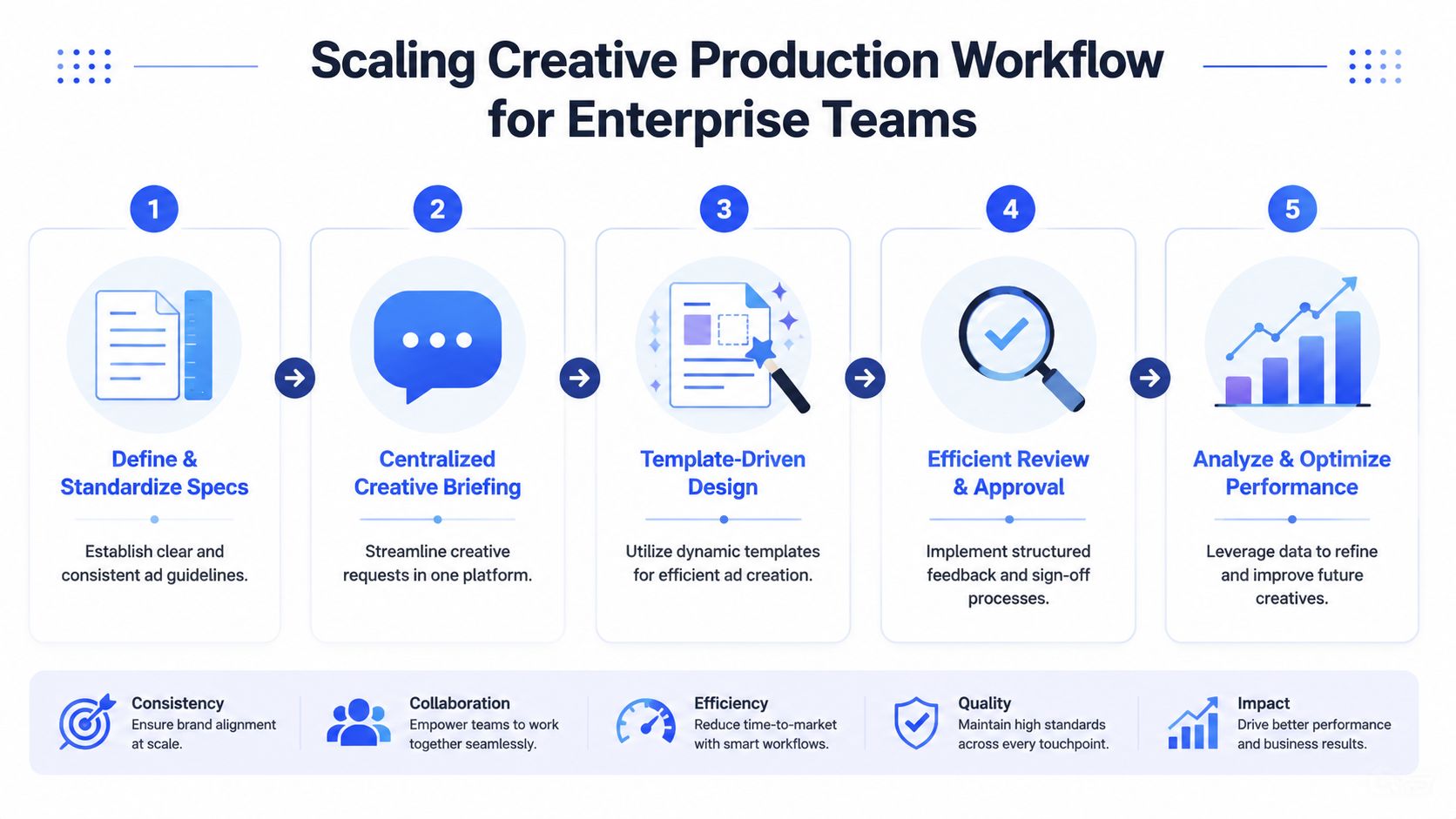
According to Pixis on Instagram sponsored post sizes and creative operations, the 4:5 aspect ratio at 1080×1350 pixels is the optimal dimension for Instagram feed ads and occupies approximately 25% more vertical screen space on mobile devices than square. The same source recommends that enterprise marketing teams standardize this ratio across feed creatives, then use automation to generate 1:1 and 9:16 variants for other placements.
That recommendation matters because it solves two problems at once. First, it gives the organization a default master asset. Second, it reduces manual re-exporting across placements.
In practice, your source of truth should include:
A good naming convention should answer basic trafficking questions before anyone opens the file.
A workable format is:
YYYYMMDD_CampaignName_Placement_Ratio_Version
Example:
20260115_WinterDrop_Feed_4x5_V03
For collaborative ad management, add optional fields when needed:
YYYYMMDD_Brand_Campaign_Market_Placement_Ratio_Language_Version
That helps enterprise growth teams sort by campaign family, market, and ratio without relying on tribal knowledge. If your buyers need Slack messages to decode filenames, the system isn't working.
Here is the other half of the production discipline:
| Field | Why it matters |
|---|---|
| Date | Prevents confusion between active and retired files |
| Campaign name | Groups related assets fast |
| Placement | Tells buyers where the asset belongs |
| Ratio | Makes QA faster before upload |
| Language or market | Prevents localization mix-ups |
| Version | Protects approved iterations from accidental overwrite |
Automation should reduce repetitive production work, not remove governance. That's especially important for enterprise teams with shared brand standards and high ad volume.
If your team is building master assets and then deriving placement variants, tools that support templating and generation can save real operational effort. Teams experimenting with AI-assisted production often use platforms like the ShortGenius AI ad creative tool to create or adapt video assets faster, especially when they need multiple hooks or format variants for testing.
The workflow works best when it follows a controlled sequence:
A centralized launch process becomes even more important at scale. Teams that manage many accounts or frequent testing cycles should align production with a documented bulk ad launching workflow so creative output doesn't bottleneck trafficking.
What works is boring by design. A fixed master ratio. Shared templates. Clear file names. Central approvals. Automatic derivatives. That's how enterprise marketing operations keep Instagram ad dimensions from becoming a recurring production problem.
Even with standards in place, a few questions keep coming up during campaign execution.
Sometimes, yes. But reuse should start from a shared master file, not from a single exported asset forced into every placement. If the campaign concept is strong, the visual system can carry across platforms. The final files still need placement-aware exports and previews.
For collaborative teams, asset libraries prove their worth. Store the master, store the approved derivatives, and label the intended platform use clearly. That keeps buyers from pulling a feed file into a vertical placement just because the thumbnail looks close enough.
Less than teams typically want.
The image or video should do the first layer of selling. The caption should support the message, not rescue a weak creative. If your ad only makes sense after reading a long block of text, the concept is probably carrying too much weight outside the frame.
A practical review question helps: if someone sees only the visual and the first line of copy, do they understand the offer or category? If not, tighten the hook.
Keep the ad understandable before the user taps "more."
Don't treat music as an afterthought. If you're using licensed tracks, brand-approved libraries, or creator-delivered edits, make sure the usage is cleared for paid distribution before launch. This matters even more when multiple teams, agencies, or local markets are uploading variants under the same campaign family.
From a performance standpoint, audio should support the message, not carry it alone. Voiceover, captions, and on-screen text should still communicate the offer if sound is off or inconsistent. For enterprise teams, the safest workflow is to maintain approved audio guidelines inside the same creative brief used for dimension and placement rules.
Strong campaigns usually come from simple discipline. The right ratio, the right composition, the right file naming, and the right approval path.
If your team is managing high-volume Meta campaigns and wants fewer tabs, cleaner approvals, and faster launches, Koast gives you a centralized way to organize creatives, publish across accounts, and keep collaborative ad management under control. It's built for teams that need structure as much as speed.
Your next 30 ad variations are on us. Test drive AdCopy AI today for no charge.


Book a call to have our team launch your first ads with you

.png)
Integrate Meta and begin publishing ads in moments with a free trial of Koast


.svg)
