

Facebook Ad Picture Size: The Authoritative 2026 Guide
Get the complete 2026 specs for every Facebook ad picture size and placement. Our guide covers aspect ratios, troubleshooting, and team workflows for agencies.
Get the complete 2026 specs for every Facebook ad picture size and placement. Our guide covers aspect ratios, troubleshooting, and team workflows for agencies.
The problem usually shows up the night before launch.
A designer exports a beautiful asset. The media buyer drops it into Ads Manager. On desktop it looks fine. On mobile, the headline gets clipped, the logo sits too close to the edge, and one version looks soft because someone handed off a file that was technically the right shape but too small. Then the account manager starts a Slack thread, the brand lead asks why the ad doesn't match approved creative, and the team burns an hour fixing something that should've been solved upstream.
That's why Facebook ad picture size isn't a trivial production detail. It sits right in the middle of campaign execution, creative quality, brand control, and launch speed. If your team manages one account, you can sometimes patch mistakes manually. If you manage multiple brands, regions, or client accounts, weak sizing discipline turns into missed deadlines and inconsistent delivery fast.
The fastest way to create friction between creative and media is to treat Facebook ad picture size like a designer-only task.
In practice, sizing errors usually start earlier. The media buyer asks for “feed assets” without naming placements. The designer builds one polished square. The client approves that single mockup. Then the trafficking team tries to force the same file into Feed, Stories, Reels, and maybe Marketplace. By the time preview issues show up, nobody's even arguing about design anymore. They're arguing about process.
I've seen the same pattern across in-house teams and agencies. A campaign doesn't slip because people don't know Facebook exists. It slips because no one defined which placements matter, which aspect ratios are approved, and what content has to survive cropping on mobile.
Practical rule: If the brief only says “need Facebook ads,” the brief isn't finished.
This matters more in enterprise environments because more hands touch the asset. Brand wants consistency. Paid social wants placement fit. Operations wants clean naming and version control. Legal may need a final locked file. Account teams want confidence that approved creative won't render differently once it leaves Figma and enters the ad account.
A strong workflow treats image size as shared ownership:
When teams do that, launch gets calmer. When they don't, Facebook ad picture size becomes the tiny technical detail that derails an otherwise expensive campaign.
At launch week, nobody wants a lecture on aspect ratios. They want a spec block the designer can build from, the buyer can traffic without resizing, and the ops team can file in the right folder so the next round does not start from scratch.
If anyone on your team needs a quick refresher on the difference between dimensions and shape, RepurposeMyWebinar explains aspect ratio in a way non-designers can understand quickly. For a broader Meta placement reference your buyers can keep bookmarked, Koast also has a useful Meta ad sizes overview.
| Placement | Recommended Aspect Ratio | Recommended Resolution (Pixels) | Team Notes |
|---|---|---|---|
| Facebook Feed single image | 4:5 | 1080 × 1350 | Best default for single-image mobile feed delivery. Keep critical copy centered and away from crop risk areas. |
| Instagram Feed single image | 4:5 | 1080 × 1350 | Use the same vertical asset when the campaign spans both feeds, but approve from placement previews, not a single static board. |
| Feed square fallback | 1:1 | 1080 × 1080 | Useful when one asset has to cover more surfaces with fewer custom exports. Expect some performance trade-off versus a feed-native vertical build. |
| Stories | 9:16 | 1080 × 1920 | Full-screen vertical is the working standard. Review text, logos, and CTAs with the native UI overlay in mind. |
| Reels | 9:16 | 1080 × 1920 | Even static creative should be composed for a motion-first environment. Leave room for interface elements and caption treatment. |
The operational takeaway is straightforward. Feed is no longer one shared canvas your team can treat as universal. For most buying teams, 4:5 is the primary single-image feed format, 1:1 remains a practical fallback, and 9:16 needs its own production path for Stories and Reels.
That distinction matters in handoff. I usually want three things attached to every approved concept: the master design file, placement-specific exports, and a naming convention that tells trafficking exactly which asset belongs in which ad set. Without that, teams waste time guessing whether final_v3_newest_REAL.jpg is the feed file, the story file, or an outdated revision.
Use this cheat sheet as an intake tool. It answers the first production question, which is what size to build. QA still has to answer the harder one, whether the approved composition holds up across the placements, accounts, and previews your team plans to run.
Creative rejection usually starts long before an upload fails. It starts when design approves one composition, buying requests broader placement coverage, and trafficking inherits a folder full of exports with no clear rule for which file belongs where.
A valid file is only the starting point. The file also has to hold up after Meta compresses it, crops it for placement, and wraps it with interface elements your designer never saw in the original mockup.
Aspect ratio defines the frame. 1:1 fills a square slot. 4:5 gives feed creative more vertical space. 9:16 is built for full-screen placements like Stories and Reels.
Resolution defines how clean that frame looks after delivery. Two images can share the same ratio and perform very differently in-market if one was exported from a weak source file or resized too many times during handoff. That is why mature teams keep one approved master and create controlled exports from it, instead of passing edited JPGs from Slack to email to Ads Manager.
The QA rule is simple. Check the shape first. Then check whether the pixels can survive platform processing without soft text, muddy product detail, or visible compression.
Safe zones belong in the brief, the design file, and the final review checklist.
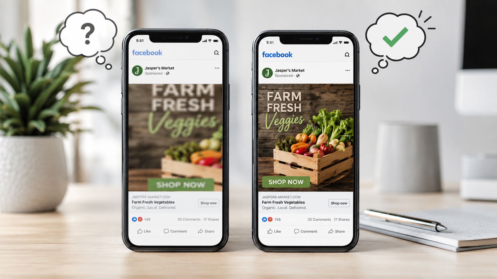
Teams get into trouble when approval happens on a clean artboard. Live ads do not appear on clean artboards. They appear inside placements with captions, buttons, profile elements, and varying crop behavior. If the logo, offer, or product claim sits too close to the edge, the ad may still serve, but it becomes harder to read or easier to reject in internal QA.
A practical rule works well across large teams: keep the message, brand mark, and product focal point inside the central area of the composition. Use the edges for supporting visual treatment, not for information the ad cannot afford to lose.
This is also where handoff discipline matters. Designers should mark the protected content area in the working file. Buyers should specify intended placements before creative production starts. Trafficking should review the exported asset in placement previews, not just confirm that the dimensions match a spec sheet.
Format choice affects more than appearance. It affects how many versions the team has to produce, how much QA the buyer has to do, and how reliably creative stays aligned across ad sets and accounts.
For single-image feed campaigns, 4:5 usually wins when mobile presence is the priority. It occupies more screen space and gives the concept more room to work. 1:1 is easier to reuse when the same asset has to cover more placements with fewer custom versions. That trade-off shows up in production workload every week.
A simple operating framework helps:
At scale, creative rejection is often a workflow problem disguised as a spec problem. The fix is not just knowing the right dimensions. The fix is giving every team the same source of truth: approved master files, placement labels that match the media plan, and a QA step that checks the actual preview before launch. That is how teams reduce rework, catch crop issues early, and keep one bad export from spreading across twenty accounts.
This is the part teams usually try to compress into one Slack message and regret later.
If you manage multiple placements, build your asset system around placement groups, not around vague labels like “social static” or “Meta image.” That naming style guarantees confusion during handoff and rework during QA.
For Facebook Feed image ads, Meta currently supports 1:1 and 4:5 aspect ratios. Minimum image sizes are 600 × 600 pixels for square and 600 × 750 pixels for 4:5. Recommended resolutions are 1080 × 1080 and 1080 × 1350, and Meta recommends vertical 4:5 for single-image ads in Facebook Feed in the official Facebook Feed image ad guidance.
That gives teams a clean operating rule for single-image feed work:
| Placement group | Supported ratios | Minimum size | Recommended build |
|---|---|---|---|
| Facebook Feed single image | 1:1, 4:5 | 600 × 600 or 600 × 750 | 1080 × 1080 or 1080 × 1350 |
For enterprise teams, that's enough to standardize the brief. Ask for either a square feed asset or a vertical feed asset. Don't ask for “Facebook post dimensions” and hope the right file appears.
A few workflow notes matter here:
Stories and Reels should be treated as their own production line.
The underlying principle from Meta is that image and video ads should use the recommended aspect ratio for each placement, and 9:16 is the standard for Stories and Reels as phones are typically held vertically, according to Meta's broader ad creative best-practice guidance.
That means a feed asset adapted into vertical at the end of the process often underperforms creatively, even when it passes technical checks. The team technically “has a file,” but the composition usually feels cramped, the text sits too high or too low, and the product focal point no longer lands where it should.
The teams that avoid last-minute redesigns treat vertical as a first-class asset, not as a resized afterthought.
Operationally, that changes the handoff:
That's how you stop a feed campaign from pretending to be a Stories campaign.
Some placements are less glamorous, but they still create production problems when no one has accounted for them.
Marketplace, search, and mixed network delivery often expose the weakness in a “one asset for everything” workflow. Even when the file technically serves, framing can shift, text can feel oversized, and image balance can break.
The safest operating model is to group these placements by behavior:
When teams insist on broad placement coverage from one image, the creative lead should mark a center-safe composition zone and the media buyer should preview every enabled placement before publishing. That extra review step is much cheaper than discovering distortion after spend starts.
The best asset libraries aren't organized by campaign name alone. They're organized by how the file will be used.
A workable folder or DAM structure usually includes:
Naming matters more than generally acknowledged. A file called final_v2_new_REALfinal.jpg is a warning sign. Use naming that tells the next person what they're holding: brand, campaign, concept, placement, ratio, version, and approval status.
For example, a naming convention like this works well:
| Asset field | Example |
|---|---|
| Brand | BrandA |
| Campaign | SpringOffer |
| Concept | ProductCloseup |
| Placement group | Feed |
| Ratio | 4x5 |
| Version | v03 |
| Status | Approved |
That produces a filename your team can trust. Not a filename they have to decode.
Good specs don't rescue weak composition. They just make weak composition render accurately.
Strong Facebook ad creative usually comes from teams that connect creative decisions to delivery conditions early. The buyer knows where the ad will run. The designer knows what has to remain visible. The reviewer knows what “approved” means in context.
The best-performing static ads aren't busy. They usually do a few things well:
For technical planning, many teams now build from higher-resolution feed masters. Independent 2025 benchmark guides converge on 1440 × 1440 px for 1:1 and 1440 × 1800 px for 4:5 as optimal feed-image working sizes, while also noting 600 × 600 px minimums and a 30 MB maximum file size, according to the Madgicx benchmark guide on Facebook ad size. That's useful operationally because larger masters hold up better after resizing and review.
If your creative ops team is exploring how AI can speed variant production, approval prep, or asset adaptation, this guide to AI for marketing production is a practical reference. Teams that automate parts of production still need a human review layer, especially for layout integrity.
Most rework starts with an incomplete brief, not with bad design talent.
A useful handoff from media buyer to designer should include:
One of the cleanest ways to reduce churn is to formalize approval before trafficking. A documented content approval workflow for marketing teams proves helpful. It prevents the common mess where a designer thinks a file is final, the buyer assumes it's approved, and the brand team still has comments.
A handoff is complete only when the next person can work without asking three follow-up questions.
That's the standard mature teams use. It's also the standard that keeps Facebook ad picture size from becoming a recurring fire drill.
A buyer signs off on creative at 4:30 p.m. The designer exported the right concept. The trafficker uploads what looks like the same file. Then the preview breaks in Feed, Stories trims the logo, and the client asks why the live ad looks different from the approved mockup.
That failure usually comes from process, not just design.
Use the same triage sequence every time: symptom, likely cause, owner, fix. Teams that skip the owner step waste hours debating whether Meta changed the rendering, whether design missed the spec, or whether the buyer uploaded the wrong version.
Symptom: The file looked sharp in Figma, Photoshop, or the approval deck, then appeared soft in preview or after launch.
Cause: Someone exported too close to the minimum dimensions, grabbed a compressed proof instead of the production file, or re-downloaded the asset from email, Slack, or a project tool that reduced quality.
Team solution: Store one approved master file and one final export set in a controlled location. Buyers should upload only from that source. Designers should label proofs and production files differently so nobody traffics a review mockup by mistake. For larger teams, connected systems are particularly helpful. A workflow tied into your ad ops stack through a marketing automation integration for creative approvals and publishing cuts down on the “wrong file, right campaign” problem.
One more check matters here. Compare the uploaded preview against the approved export before the campaign goes live. That catches compression issues before spend starts.
Symptom: The ad technically fits the spec, but logos, badges, pricing, or offer text sit too close to the edge and lose readability in certain placements.
Cause: The layout treated the full canvas as usable space. Meta does not display every placement the same way, and overlays or interface elements can crowd edge content even when the image itself is valid.
Team solution: Build with an internal safe area, not the outer edge of the file. QA should review the ad in placement preview, not just in the design file. If the message breaks, resizing the logo is rarely enough. Rework the composition so the product, offer, and brand marker stay readable inside the protected center area.
This is also a handoff issue. If the buyer never flagged which element must survive every crop, design will guess. That guess often fails in mobile placements.
Symptom: A horizontal or custom-ratio image looks fine in one view but feels badly framed in mobile Feed, with key text or product detail missing.
Cause: Feed rendering can crop or reframe creative in ways that expose weak compositions. Wide-first layouts are the usual problem because they depend on edge space that does not hold up across placements.
The practical takeaway is simple. If the concept only works when the full canvas stays visible, it is too fragile for paid social.
Team solution: Keep all critical text and product detail away from crop-prone edges. If one asset has to cover broad feed delivery, square is usually the safer fallback. If mobile feed is a priority placement, design for that ratio first instead of adapting a horizontal concept after approval.
At scale, this should become a QA checkpoint, not a creative debate. The buyer confirms placement coverage. The designer exports by ratio. The trafficker checks the preview against the approved version. If any one of those steps is loose, cropping errors show up after launch instead of before it.
Manual creative management works longer than it should. Then a team adds more brands, more markets, more accounts, or more approvals, and the whole system starts leaking time.
What usually breaks first isn't strategy. It's version control. One buyer launches an outdated image. Another buyer uses the right concept in the wrong ratio. A designer updates the asset in the shared folder, but nobody knows whether the ad account contains the current file. Once that happens across several accounts, creative QA becomes detective work.
The broader direction of Meta creative has moved toward larger, mobile-first assets, with guides recommending 1440 × 1440 or 1440 × 1800 for Feed and 9:16 for Stories and Reels, which reinforces the need for placement-specific assets rather than a one-size-fits-all workflow, as noted in Shopify's coverage of mobile-first Facebook ad sizes.
That trend creates a workload problem for teams that still depend on folders, chat approvals, and one-by-one publishing. The more placements you activate, the more likely you are to create duplicates, lose approval history, or traffic the wrong file.
Common failure points look like this:
A centralized workflow gives the team one source of truth for creative, approvals, and launch state.
In practice, that means:
For enterprise teams, the advantage isn't just speed. It's governance. When someone asks which version was approved, who changed it, or where it was launched, the answer should be visible immediately. That's especially important when multiple business units, agencies, or regional teams touch the same campaign family.
A more mature setup also makes automation safer. If your team is tying ad execution into broader systems, this kind of marketing automation integration approach becomes important because it reduces handoff gaps between production, approval, and launch.
Teams don't get into creative chaos because they lack smart people. They get there because smart people are working from disconnected systems. Facebook ad picture size is one of the clearest places where that breakdown becomes visible.
If your team is juggling creative versions, approvals, and launches across multiple Meta accounts, Koast gives you a centralized way to manage assets, QA campaigns, and publish at scale without the usual tab-heavy workflow. It's built for marketing teams and agencies that need control, speed, and cleaner collaboration across the entire ad launch process.
Your next 30 ad variations are on us. Test drive AdCopy AI today for no charge.


Book a call to have our team launch your first ads with you

.png)
Integrate Meta and begin publishing ads in moments with a free trial of Koast


.svg)
