

Meta Ad Sizes Guide 2026: All Specs & Ratios
Get complete, up-to-date Meta ad sizes for 2026. Find all specs, ratios, and workflows for Feed, Reels, and Stories to optimize your campaigns now.
Get complete, up-to-date Meta ad sizes for 2026. Find all specs, ratios, and workflows for Feed, Reels, and Stories to optimize your campaigns now.
Your team already knows the feeling. Creative is ready, but one variant gets cropped in Feed, another looks cramped in Stories, and someone is still asking which folder holds the latest 9:16 export. Media buyers start launch QA in Ads Manager, designers get pulled back into resizing, and campaign timelines slip because no one agreed on a standard before production started.
That's why meta ad sizes aren't just a design reference. They're an operating model. If your team manages multiple brands, regions, product lines, or ad accounts, size decisions affect briefing, asset naming, approvals, QA, launch speed, and brand consistency. The teams that stay organized don't memorize every placement. They standardize what they produce, define where custom variants are worth the effort, and centralize how assets move from design to launch.
Most ad ops problems around creative don't start in Ads Manager. They start earlier, when teams treat specs as informal knowledge instead of a shared process. One designer exports square by default. Another builds for vertical. The media buyer assumes one asset can run everywhere. By the time launch day arrives, everyone is solving preventable problems in a hurry.
For enterprise teams, that chaos gets expensive fast. It slows approvals, creates avoidable rework, and leads to inconsistent brand presentation across business units and ad accounts. It also makes reporting harder because performance conversations get mixed up with execution errors. If a format underperforms, was it the message, the audience, or the fact that the creative was badly adapted for placement?
A useful single source of truth should answer four things:
Practical rule: If a media buyer has to ask design for a last-minute resize during launch QA, the workflow failed upstream.
This is also where collaboration matters. Brand, creative, media, and marketing ops need one playbook, not four interpretations. Teams that pair spec standards with shared reporting usually move faster because they can separate execution issues from performance issues. If you're tightening that workflow, it helps to align creative standards with a clearer Facebook ads reporting process for cross-functional teams.
A real standard doesn't need to be long. It needs to be enforced. The best versions are usually a short internal page or creative brief template with approved ratios, placement notes, safe-zone guidance, and naming conventions.
That document becomes the handoff point between teams. Designers know what to build. Paid social managers know what to request. QA knows what to check before publishing.
A launch slips fastest at the asset handoff stage. Media is ready, approvals are done, but the team is still chasing last-minute crops because design delivered one format and Meta is serving across placements that need different framing.
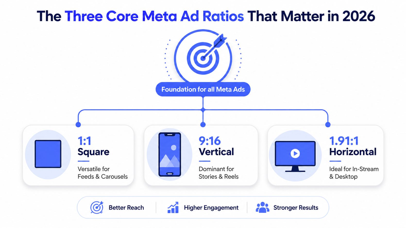
The fix is to standardize production around three ratios, then decide in advance which placements get native variants. For most enterprise teams, that means 4:5, 9:16, and 1:1. Those three cover the bulk of day-to-day Meta execution without turning every campaign into a custom resizing project.
| Ratio | Typical use | Team role |
|---|---|---|
| 4:5 | Feed creative | Primary performance master for mobile-first Feed campaigns |
| 9:16 | Stories and Reels | Native full-screen asset built for vertical viewing |
| 1:1 | Carousel and fallback use cases | Shared format for compatibility, product cards, and overflow placement support |
That table matters because ratio decisions are usually operational decisions first. If every campaign starts with those three approved outputs, creative briefs stay tighter, file naming stays cleaner, and paid social teams stop requesting avoidable one-off edits during QA.
The trade-off is real. Standardizing on three ratios reduces production drag, but it only works if the team is disciplined about when to break the rule. A product launch with heavy Reels spend should get a true 9:16 concept, not a cropped Feed ad. A catalog-heavy campaign may need square companions from the start because carousel readability matters more than squeezing one extra vertical adaptation out of the system.
4:5 is the best starting point for Feed because it gives more vertical real estate on mobile than square. It usually holds attention better in scroll and gives designers more room for product framing, pricing, or offer hierarchy without forcing cramped layouts.
9:16 needs to be treated as its own creative environment. Teams lose efficiency when they pretend one Feed master can cover Stories, Reels, and short-form video placements without reworking pacing, text position, and focal points. If your team is aligning Meta production with broader cross-channel video planning, this guide to effective video aspect ratios for marketing is useful because it gives creative and paid teams a shared baseline before assets enter review.
1:1 still earns its place because it is stable. It works well for carousel systems, product-led ads, and fallback coverage when account structure or launch timing makes full native versioning unrealistic.
A practical framework is simple: build 4:5 as the default Feed master, require 9:16 for campaigns with meaningful Stories or Reels investment, and keep 1:1 in the asset set whenever carousel, catalog, or broad placement coverage is in play. That keeps the ratio system small enough to manage, while still giving media buyers the formats they need.
A common enterprise failure looks like this. Creative approves one polished Feed asset, regional teams duplicate it across dozens of ad sets, then paid social catches crop issues, unreadable offer text, and mismatched filenames after launch. The result is not a minor formatting problem. It is delayed spend, messy QA, and too many creative exceptions for the team to manage by hand.
Feed and Marketplace need a production standard that is easy to request, easy to review, and easy to find in your asset library six weeks later.
For Feed image ads, the working standards are still 1080×1080 px (1:1) and 1080×1350 px (4:5). Meta also supports higher-resolution versions of those same layouts, and Vizup's 2026 Meta ad specs summary is a useful reference if your design team wants a current spec check before export. In practice, those two ratios cover the majority of Feed and Marketplace image needs without creating an oversized variant library.
For Feed-first campaigns, request 4:5 as the master file. It uses mobile screen space better and gives the team more room for product framing, pricing, and offer hierarchy.
For mixed placement campaigns, request a 1:1 companion at the same time. That single step prevents one of the most expensive workflow mistakes in large accounts. Paid social should not be opening a launch ticket because only one approved ratio exists.
A workable brief usually includes:
That last line matters more than teams expect. If assets arrive as Final_v3_new_USETHIS.jpg, scale breaks fast.
Marketplace is less forgiving of abstract brand creative. Clear product presentation, obvious pricing context, and clean framing tend to hold up better than lifestyle-heavy compositions that rely on surrounding copy to explain the offer.
This creates a real trade-off for enterprise teams. Reusing one Feed asset across every shopping-oriented placement reduces production volume, but it can also lower clarity in Marketplace and make product intent weaker. The right answer is usually not “build everything from scratch.” It is to maintain a small approved variant set tied to placement type, then automate resizing and trafficking from one centralized asset system.
That is the operational gap many teams miss. The ratio spec is easy. Version control is the hard part.
Feed and Marketplace workflows usually fail because of process, not because the team forgot the pixel dimensions:
A better setup is simple. Keep approved masters in one central library, map each asset to its valid placements, and automate derivative exports instead of requesting fresh manual crops every time a campaign changes. That gives paid teams speed without creating a parallel design process inside the ad account.
For teams aligning Instagram creative with Meta production standards, quso.ai's Instagram dimension guide is a practical reference for keeping square assets consistent across design and publishing workflows.
A common failure looks like this. The team approves a feed video on Friday, the buyer needs Reels, Stories, and in-stream variants by Monday, and creative ops spends the weekend resizing files that were never designed for vertical UI. The ad serves, but the headline sits under the interface, the CTA gets buried, and performance drops for reasons that do not show up in the spec sheet.
Stories and Reels are the clearest case for building a vertical-first workflow. Meta supports image files up to 30 MB and video files up to 4 GB, with common delivery in MP4 or MOV using H.264, according to Superscale's Meta ad sizes guide. In practice, the working decision is simpler. Use 1080×1920 (9:16) as the approved master for full-screen placements, then traffic that asset only where the layout fits.
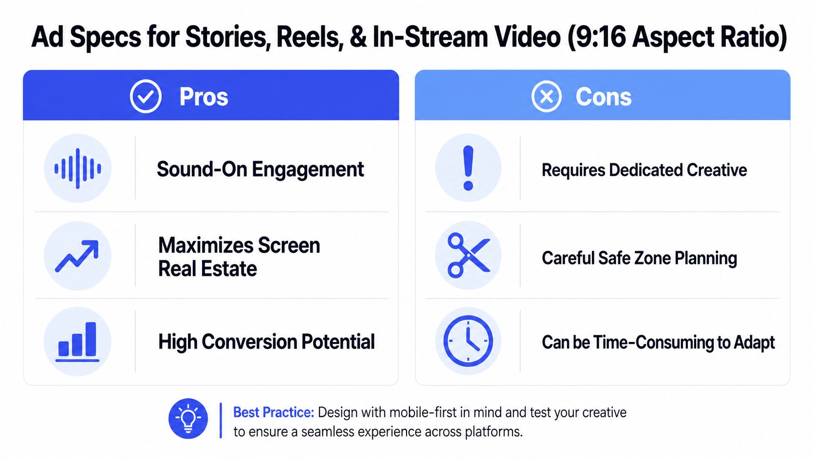
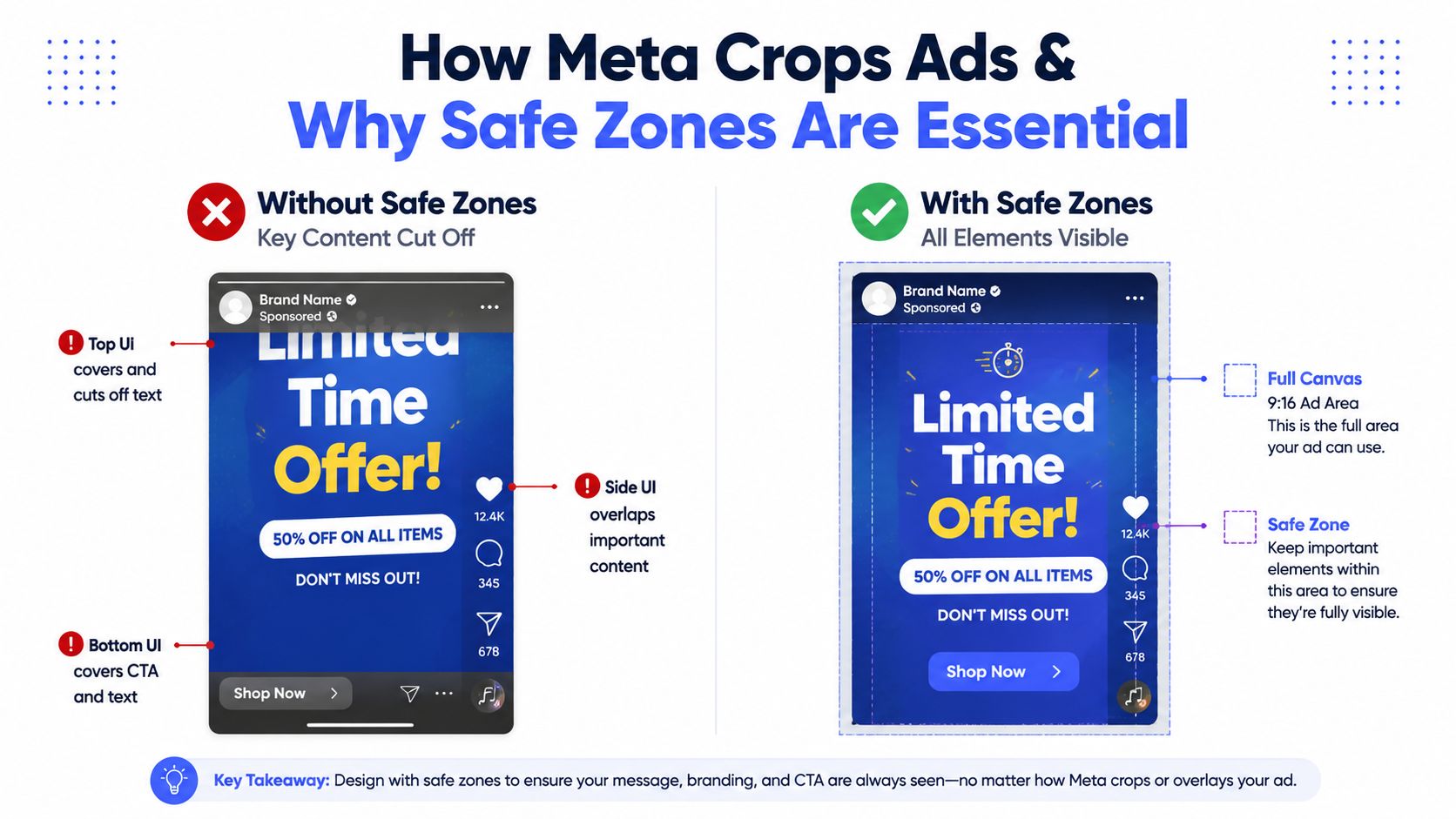
Safe zones are a production requirement, not a design preference. As noted earlier, Meta recommends keeping key elements clear of the top, bottom, and side interface areas. Teams usually know that in theory. The failure happens in review, where stakeholders approve against the full canvas instead of the usable canvas.
The bottom portion causes the most waste. Captions, profile elements, CTAs, and placement UI compete for that space. If the offer, proof point, price, or speaker subtitle sits too low, the ad can pass QA and still lose comprehension in the first second.
For enterprise teams, process matters more than another export preset. A workable setup tags every vertical asset in a central library with placement eligibility, safe-zone validation, owner, and approved revision status. Then buyers pull from approved variants instead of requesting one-off crops in Slack. If your team also runs immersive units, this guide to creating an Instant Experience ad on Facebook helps define which assets belong in a full-screen workflow versus a standard vertical placement.
Use this review checklist before launch:
A useful visual walkthrough is below.
In-stream video gets mishandled because teams group it with every other video placement. That creates bad edits. Full-screen pacing can feel slow or oversized in in-stream, while feed-style framing often looks cramped and forgettable.
Treat in-stream as its own approval path. The right question is not whether the file meets platform specs. The question is whether the first frames still communicate in a placement where attention is weaker, context is different, and the viewer did not opt into an immersive experience.
The efficient model is straightforward. Keep one centralized asset system, define which masters are approved for Stories and Reels, define which edits are approved for in-stream, and automate derivative exports from those masters. That reduces duplicate versions, keeps naming clean, and stops buyers from spending budget on creative that technically fits but was never built for the placement.
These formats look simple in the interface, but they create more coordination overhead than single-image ads. That's because the ad unit isn't one file. It's a set of assets that have to work together.
For carousel cards, 1:1 is frequently the cleanest working format because it's broadly compatible and easier to keep consistent visually. The primary challenge isn't the card dimension itself. It's getting every card to feel connected while still making sense on its own.
Creative teams should decide early whether the carousel tells a sequence, compares products, or repeats one offer with different proof points. Media buyers should not be deciding that during upload.
A reliable review process checks:
Collection ads usually break when catalog imagery and campaign creative are managed in separate silos. The hero asset may look polished, while the downstream product tiles feel inconsistent, poorly cropped, or off-brand.
That's why enterprise teams need a shared handoff between paid social, ecommerce, and creative ops. The ad unit should be reviewed as one experience, not as a top asset plus a product feed someone assumes is “good enough.”
If your team uses Instant Experience with Collection, keep the build process documented and standardized. This walkthrough on how to create an Instant Experience ad on Facebook is useful for aligning the media buyer and the person managing the post-click canvas.
Collection ads need ownership on both sides. One team handles the campaign shell, another controls the catalog and supporting visuals. If those groups don't sync, the user sees the gap immediately.
Messenger creative often suffers from reuse. Teams take a polished feed asset, drop it into Messenger, and move on without checking whether the visual framing still fits the context. The issue isn't usually technical rejection. It's that the message feels transplanted.
The practical fix is to maintain a small approved set of Messenger-ready templates inside your creative library. That's enough to keep launches efficient without turning Messenger into a custom design project every time.
Most “best meta ad sizes” advice stops too early. It tells teams the recommended ratios, but not what happens when assets move outside their ideal placement.
Meta's own placement guidance distinguishes between supported and recommended ratios, and it notes that 4:5 is recommended for single-image feed ads while 9:16 is recommended for Reels and Stories capture, as explained in Meta's placement guidance. That difference matters. Supported doesn't mean optimal. It often means the ad can run, but the layout may still be cropped, padded, or visually crowded.
A feed-first creative pushed into a vertical placement can lose balance fast. The product may stay visible, but the headline shifts too high, the logo gets pinned near interface elements, and the callout at the bottom competes with platform UI.
A vertical creative reused in a non-native context can feel equally off. Even when the platform accepts it, the composition may look cramped or adapted rather than designed.
The core issue is simple. Cropping doesn't just remove pixels. It changes visual hierarchy. That means the element you intended as the hook may no longer be the first thing users notice.
Recent 2026 guidance emphasizes that safe zones matter because interface overlays can cover a large share of vertical creative. The practical question is not only what size to use, but what elements must move so they survive overlays and cross-placement cropping.
A good internal review asks:
If your designers need a shared vocabulary for this, BlitzReels has a concise explanation of the social media safe area that's useful for creative QA and briefing.
If an element matters enough to mention in the brief, it matters enough to protect inside the safe zone.
There are cases where one creative can do enough. Square assets can be a practical fallback. Simple product imagery with centered composition can adapt reasonably well. Minimal text layouts also travel better than crowded promotional designs.
But teams should call this what it is. It's a compromise for speed and coverage. It isn't the same as placement-native creative.
The old workflow still shows up in too many teams. Design exports assets into shared folders. Paid social requests extra versions in chat. Someone downloads local copies, renames them manually, uploads them one by one, and catches mistakes during launch QA instead of before it. That process works until account volume rises or approvals stack up.
At scale, the problem isn't only resizing. It's governance. Teams need to know which asset is approved, which variant belongs to which market, who changed what, and whether the published ad matches the final creative. Manual processes struggle there because the knowledge lives across people, folders, and browser tabs.
The goal isn't to automate for the sake of it. The goal is to reduce repeated human decisions around file handling, naming, approvals, and placement adaptation.
A stronger operating model usually includes:
That setup makes collaboration easier for enterprise teams because regional marketers, paid media leads, and designers can work from the same creative source instead of maintaining parallel systems.
Automation is most useful when it removes low-value production work. Resizing, asset assignment, templated campaign creation, and repetitive QA checks are good candidates. Strategic decisions like messaging, creative direction, and testing priorities still need people.
One option in that category is dynamic creative workflow automation for Meta campaigns, which shows how teams can structure repeatable creative testing and publishing more efficiently. In practice, platforms like Koast centralize creative libraries, permissions, QA steps, and campaign launch tasks so teams can publish across multiple ad accounts without relying on tab-heavy manual execution.
The most useful automation doesn't replace creative judgment. It protects it by removing file chaos and handoff errors.
Don't try to rebuild the whole system in one sprint. Start with one business unit or one campaign type.
Use this sequence:
That's the point where meta ad sizes stop being a recurring production problem and start behaving like a governed system.
You can, if speed matters more than placement-native presentation. Square is the safest broad fallback. It's often good enough for simple concepts, especially when the composition is centered and the message is minimal. It's not the right standard if your team is pushing hard into Feed performance or vertical video placements.
Not always. But it's usually the strongest default when mobile Feed is a major priority. The extra vertical space gives the creative more presence, and it gives designers more room to stage the visual hierarchy cleanly.
No. A resized asset can fit the slot, but it often carries the wrong pacing, text placement, or framing. Native 9:16 creative is built around the placement from the start, including safe zones and screen behavior.
Treating specs as a design-only concern. The issue is operational. If creative standards don't live inside briefing, approvals, storage, naming, and launch QA, the team keeps paying for the same mistakes.
Use a structure your media and creative teams can both easily access. At minimum, include campaign or concept name, ratio, market or brand, version, and approval status. Keep archived versions separate from approved launch-ready assets so nobody publishes the wrong file under deadline.
It's acceptable when the concept is visually simple, timelines are tight, and the team has chosen coverage over placement-perfect polish. That can be a sensible decision. Just make it explicit so no one mistakes a compromise for a standard.
If your team is juggling creative variants across multiple Meta ad accounts, Koast gives you one place to manage approved assets, launch campaigns, coordinate permissions, and reduce the manual resizing and publishing work that slows enterprise paid social teams down.
Your next 30 ad variations are on us. Test drive AdCopy AI today for no charge.


Book a call to have our team launch your first ads with you

.png)
Integrate Meta and begin publishing ads in moments with a free trial of Koast


.svg)
